Hello there! Welcome back to Jennifer’s Visual Design Blog section. I know I have not been able to publish here lately due to some overwhelming projects. Since the semester has come to an end, and I have room to breath now. I wanted to show a few of the projects that I have been working on throughout my college semester.
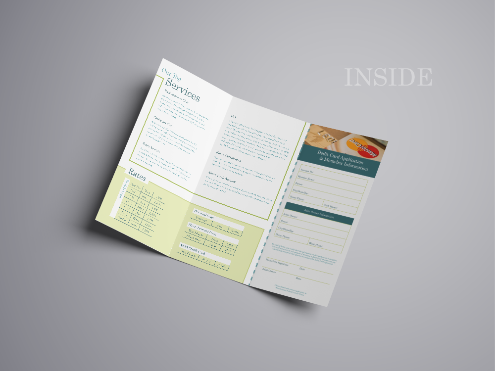
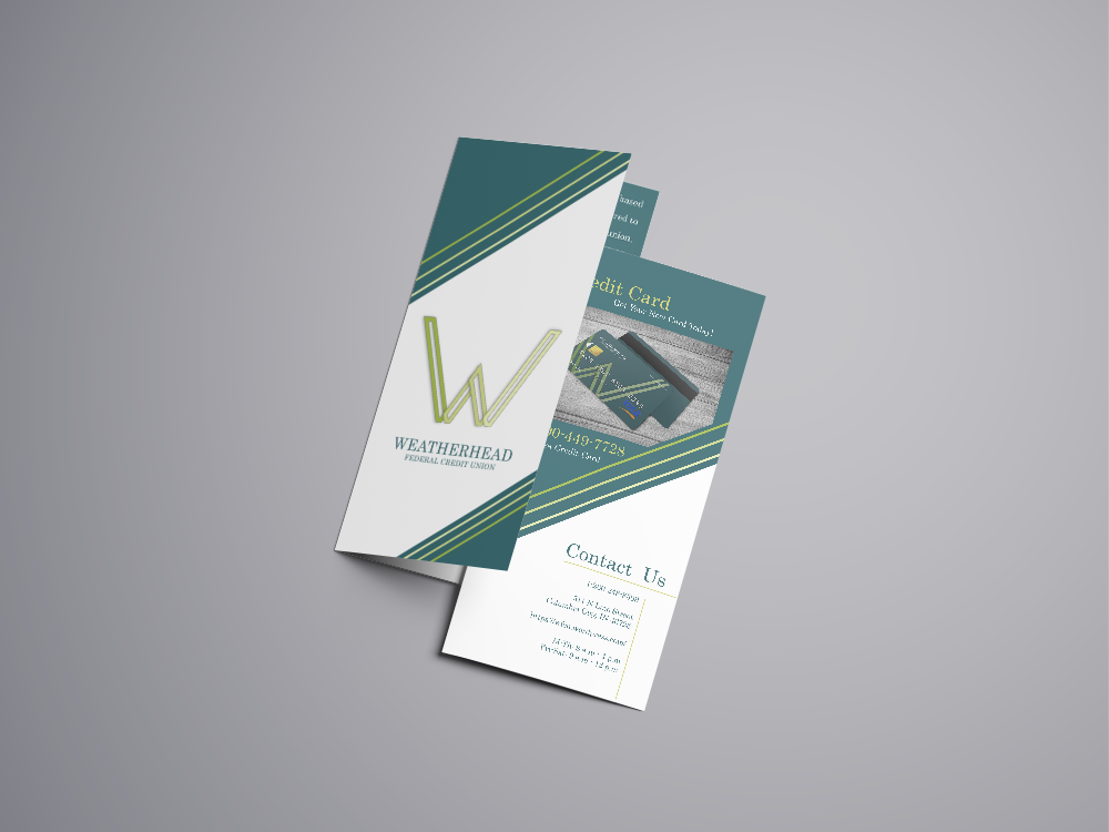
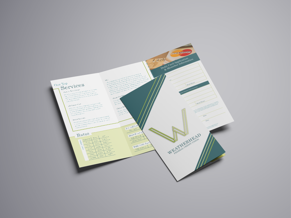
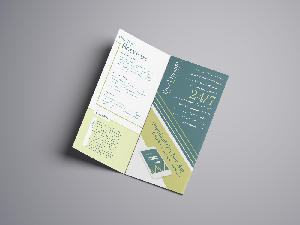
This particular project is aimed toward establishing a new brand and identity for a small town bank that I have known for years. This particular bank is not quite up-to-date with today’s technology that is provided within our society. I started this project in aims to help understand the key benefits towards keeping up-to-date with the everyday standards within the technological world that we live in. I started from scratch with a new color palette, and then worked my way towards making this bank mobile worthy. Within this blog post I am going to show what elements I presented within different outlooks, and show you what the overall identity would be presented for this brand.
Awards in:
Silver : Logo & Icon Design : American Advertisement Federation of Fort Wayne : February 1st, 2018
Logo
App IconBank Logo ColoredBank Logo Black & white
Brochure
Outside of BrochureInside of BrochureFront & Back FoldsInside of Brochure w/ FrontFolds of Brochure
The dog days of summer are coming to an end, but I enjoyed every minute of it! This past summer of 2016 I had the chance to be a Graphic Design Intern at a local organization here in Fort Wayne, IN known as Associated Churches of Fort Wayne and Allen County. I had the privilege of helping their Creative Department by enhancing a variety of their inner organizations with creative redesigning and re-branding through a multitude of ways.
Logo Designing was one of the great accomplishments I was able to establish during my summer internship. I was able to create two new design re-brands for their organizations.
The Landing Logo: The Landing is an organization that Associated Churches has put together to help troubled teens with a place to feel comfortable and safe in times of need. I re-branded their logo design with a two-in-one design that has a typographic form and a symbol form, and together makes an overall balanced logo.
Hunger Action Month Logo: Hunger Action Month is a county wide can food drive that helps stock up their pantry for families in times of need. They pass out their collected foods at a wide variety of food pantries within the Fort Wayne district to help out their community with hunger needs. I redesigned their logo with a fall theme in mind that establishes colors and a concept of a pear and plate combined.
Pamphlet-Brochure Designing was a effort all in itself. If you have ever designed a layout for a template of a brochure then you understand. I was able to create two designed pamphlets for Associated Churches that are located within their main building.
Planned Guide to Giving:The Planned Guide to Giving Pamphlet is a 5 page information packet that focuses toward the Retirement Plans and Funeral Arrangements Packages they offer for elderly individuals. I designed this pamphlet with a overall natural theme with bright colors and pleasantly focused imagery.
Programs Guide: The Programs Guide is a generalized information packet that lets individuals know all the programs and organizations that Associated Churches provides and also helps function within their large networking association.
Last, but not least I was able to put my creative uses towards helping establish an overall email for a Community Prayer Breakfast Event that was sent out to all of Associated Churches networking individuals. The ideal theme for this email was with it being a Prayer Breakfast, that I wanted to establish a comfortable feel with using imagery that incorporated food, coffee, and that of individuals being social. I used two complimentary fonts throughout the email, while establishing an overall Red-Maroon look through out the email also.