Whips and Grins

Hello Again!

Not so very long ago, I had the grandest of opportunities. I was able to step out into the countryside and enjoy a few good moments of capturing this handsome gentleman’s whips and grins. Chantry was an enjoyment to work with, and being able to capture this once in a life time moment was beyond heart warming. Below are an assortment of photos from his big day, and I wish him the best of luck on his next adventures in life.


Mr. & Mrs. Green

Hey again!

I got the lovely opportunity to snap a few shots of this couples little summer elopement!

Mr. & Mrs. Green shared their vows this past weekend on a sunshine filled day, in the surrounds of mother nature. What a fantastic experience this was, and I would love to continue capturing their future moments and memories!


New Brand & Identity Concept for a Bank

Hello there! Welcome back to Jennifer’s Visual Design Blog section. I know I have not been able to publish here lately due to some overwhelming projects. Since the semester has come to an end, and I have room to breath now. I wanted to show a few of the projects that I have been working on throughout my college semester.

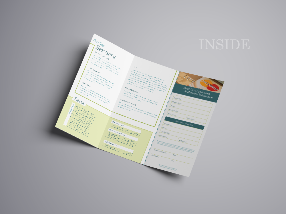
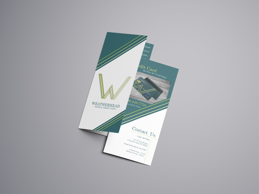
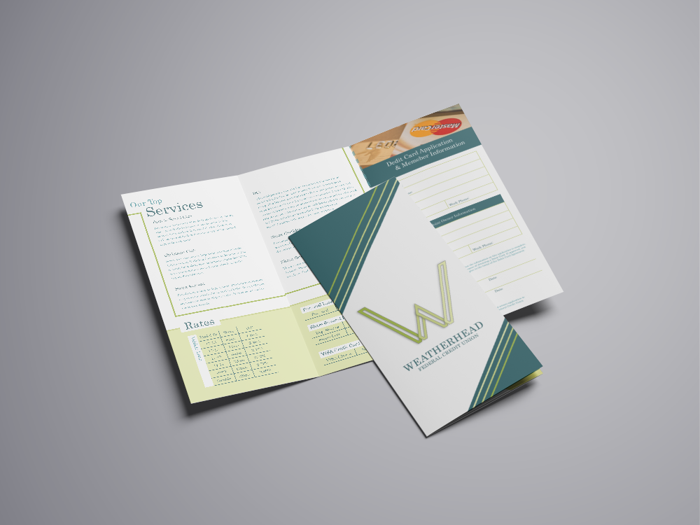
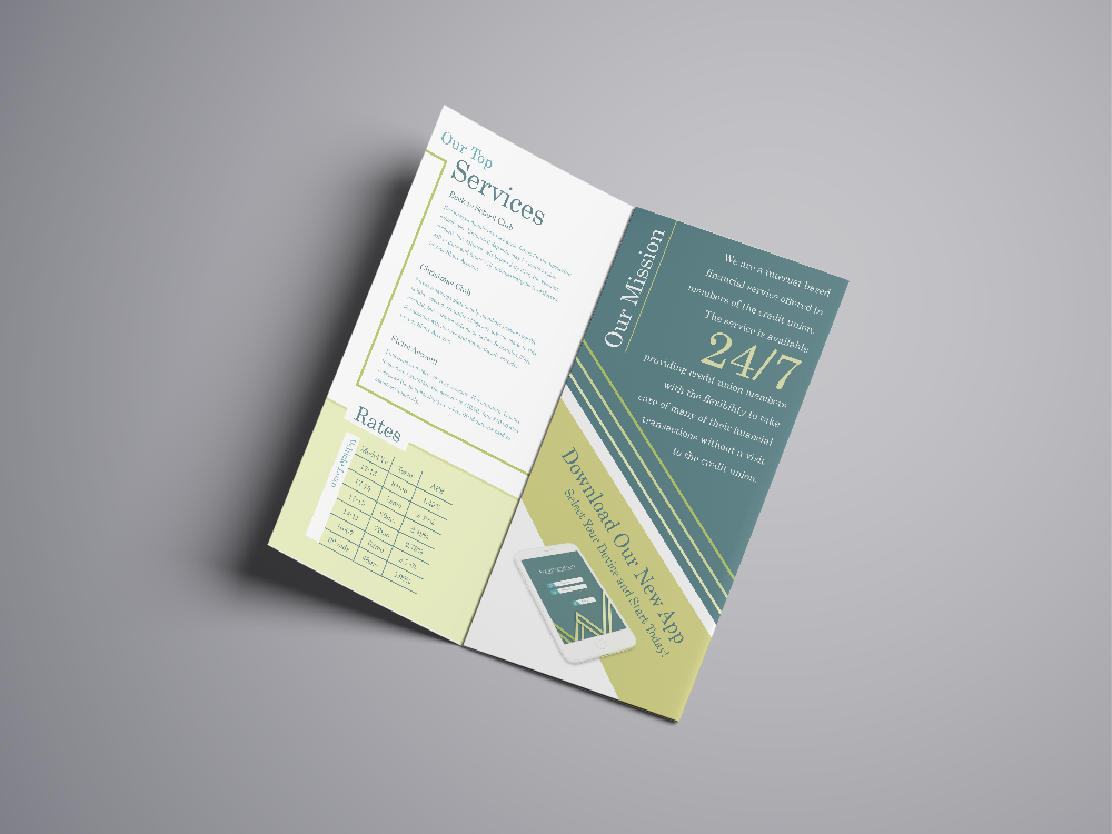
This particular project is aimed toward establishing a new brand and identity for a small town bank that I have known for years. This particular bank is not quite up-to-date with today’s technology that is provided within our society. I started this project in aims to help understand the key benefits towards keeping up-to-date with the everyday standards within the technological world that we live in. I started from scratch with a new color palette, and then worked my way towards making this bank mobile worthy.  Within this blog post I am going to show what elements I presented within different outlooks, and show you what the overall identity would be presented for this brand.

Awards in:

Silver : Logo & Icon Design : American Advertisement Federation of Fort Wayne : February 1st, 2018


Logo


Brochure


Website & App


Credit Card Concept

How To Properly Photograph a Vehicle for Re-Sale

how-to-properly-photograph-a-vehicle-for-resale-pinterest


Hi again! Welcome back to Jennifer’s Visual Design’s blog this week, and I am going to show you How-To Properly Photograph a Vehicle for Re-Sale. I got this idea from viewing a few craigslist pages of vehicles trying to be sold on the online market. Which comes in handy due to one of my jobs as a photographer at Kelley Automotive in Fort Wayne, IN.

You can do this photo process on any sort of device that has a form of camera attached to it such as a cell phone, tablet, digital camera, or a DSLR camera. Most individuals take photos with their phone to make the process easier to transfer from phone memory too whatever marketing platform you are trying to sell your vehicle on.

I will be showing you this process with photos I have already taken in an enclosed environment at my work for better quality, but this process will work in whatever environment you are in. To help with the photo taking process, and to attract more viewers look into washing, waxing, and detailing your vehicle before capturing images for re-sale.


How To Steps

Starting Step: Start by photographing the front passenger side of the vehicle to show the viewer a outside view of the vehicle first.

20161104_123906


Second Step: Proceed to go into the inside of the vehicle to photograph the inside, starting with the center council to capture the display in reverse mode, and then on home mode. Then go on to capture the heating elements, and if the vehicle is a 4×4 then capture the push button and/or stick shift to show the viewer the options available.


Step Three: Move your camera back far enough to capture the entire steering wheel and part of the center council, then move in closer to capture any of the steering wheel amenities buttons (cruise control, volume control, and etc). Then place your camera near the horn to capture the dash display so viewers can see the mileage, the entire set up of the display, and if any lights are on.


Step Four: Step out of your vehicle, and then move to the front of the vehicle to capture a 180 degree area of your vehicle by capturing the front of the vehicle, then the front driver’s side, the back driver’s side, the entire back of the vehicle, and then the back passenger side of the vehicle.


Step Five: Move back to the front of the vehicle and then capture the front driver’s side tire so show your viewer the amount of tread that is still applied towards the tire. Then capture the inside of the vehicle starting with the front driver’s side, then capture an image of the inside of the door to show the viewer the amenities. Duplicate this process on the passenger side, back passenger side, and back driver’s side. Do not forget to capture extra amenities on the inside such as dvd players, remotes, headphones, and even the third row seat!


Step Six: Move to the back of the vehicle and if you have a car with a trunk then try and capture the best you can of the size and inside as you can. If you own a SUV/Van then open up hatch and capture the inside from the rubber seal in, then capture the button (if applicable) that automatically shuts your hatch. If you own a truck, then unlatch the tailgate and capture the inside of the bed of the truck. Also if you’re SUV, Van, or Truck has a hitch then capture an image of it to show the viewers the individual hook up’s and what condition it is in.


Step Seven: Move back to the front of the vehicle, lift the hood, and capture an image of the motor. If you have any extra amenities that are under the hood make sure to capture them also for the viewer’s information.

20161104_124642


Step Eight: Last but not least, capture an image of the keys. Your viewer’s like to see the keys to make sure that you have them, and the options that are provided upon the key fob (if you have that option).

20161104_125536


Extra Input: Some of the extra options that you can provide for your viewer that will help encourage them to possibly purchase your vehicle would to apply a video of the vehicle running so the viewer can hear the engine and exhaust conditions of the vehicle. If you own a 4×4, provide a video of the vehicle tow show that what condition that 4×4 transfer case would be in.


I hope this week’s How-To steps were helpful and informative towards your next re-sale. Please leave a comment on any improvements, and/or questions. Hope to see you next week, Thanks!

12 Elements of a Remarkable Photograph


12-elements-of-a-remarkable-photograph


Hi there, this week’s blog post is going to be about the top elements for creating a unique and outstanding photography! I am going to share with you the top twelve elements towards making a remarkable photograph. These elements are defined as necessary parts towards the success of an image.
Well; image, art piece, or photograph that will reveal some means of all of these twelve elements. A visually superior image will reveal obvious consideration of each one of these elements in some sort of visual way.


Impact: is the first view of an image for the first time. Compelling images evoke laughter, sadness, anger, pride, wonder or another intense emotional feeling that an individual gets when viewing the image.

Creativity: original, fresh, and external expression of the imagination of the maker by using the medium to convey an idea, message, or thought.

Technical Proficient: the print quality of the image itself as it is presented for viewing. Retouching, manipulation, sharpness, exposure, printing, mounting, and correct color are some design aspects that speak to the qualities of the over all print.


element-4-composition


Composition: the importantance towards the design of an image, bringing all of the visual elements together to express the over all purpose of the image. Proper composition holds the viewer in the image and prompts the viewer to look where the creator intends. Effective composition can be pleasing or disturbing, depending on the intent of the image maker.

Lighting: the use and control of light—which we talked about in last weeks post on “The Art of Lighting” which refers to how dimension, shape and roundness are defined in an image. The light applied towards an image could be man made or natural, but proper use of it should enhance the image.

Style: is defined in ways as it applies to a creative image. It might be defined by a specific genre or simply be recognizable as the characteristics of how a specific artist applies light to a subject. It can impact an image in a positive manner when the subject matter and the style are appropriate for each other, or it can have a negative effect when they are at odds.

Print Presentation: affects an image by giving it a finished look, which the mats and borders used should support and enhance the image, not to distract from it.


element-8-center-of-interest


Center of Interest: the point or points on an image where the maker wants the viewer to stop as they view the image. There can be primary and secondary centers of interest, but occasionally there will not be a specific center of interest. When the entire scene collectively serves as the center of interest.

Subject Matter: should always be appropriate to the story being told in an image.

Color Balance: is the over all harmony of an image, in which the tones work together to effectively supporting the image and enhance its emotional appeal. Color balance is not always harmonious and can be used to evoke diverse feelings for effect.

Technique: is the approach used to create the image. Printing, lighting, posing, capture, presentation media, and many more are parts of the techniques that can be applied to an image.

Story Telling: the image’s ability to evoke imagination. Each viewer might collect his own message, or read their own story in an image.


Thank you for reading this week, and do not forget to follow on Bloglovin

15 Simple Posing Ideas


15-simple-ideas-towards-posing-your-clients

I have had all kinds of issues over the years since I have been photographing with clients of trying to pose and position them to look good during a photo shoot. Well, with today’s blog post I am wanting to help you out, with my years (and continues practice) of mistakes of posing individuals/ your clients during a photo shoot and them turning out amazing. I am using a recent client of mines images from her professional head shot photo shoot, which she is an amazing photographer herself! Check her out her amazing work at Taylor Dixon Photography or connect with her on Facebook or Instagram!

In today’s post I have acquired 15 photographic posing points that will hopefully help you on your next big or small shoot with any potential client!


  1. Posing Stool Height – Normally should be at about knee height. If you want to add weight to a subject, lower the stool. If you wish to decrease the apparent weight, raise the stool. If stool is raised to it maximum a heavy set person will have to lean and reach forward to have his feet reach the floor. This brings his face closer to the camera, diminishing the apparent size of his body, it also stretches out his chin eliminating the double chin.
  2. Create a Solid Pyramid Base – Shoulders square to the camera subject looks too heavy and boring. Shoulders turned sideways = to narrow and not enough base. Shoulders at a 45 degree angle give good base and texture to the outfit.


blogpost-1
Sit Up for a Professional Looking Headshot


  1. Sit Tall – place your finger in the subject back on a lower vertebrae and subject will grow 2-3 inches. Avoids the slouchy look.
  2. Lean Forward Slightly – creates a better proportion between head and body and also creates implied movement.
  3. Project the Chin – This stretches out any double chin and keeps the face proportional. These first 5 steps should only take a bout ten seconds to complete and will add dramatically to the final portrait.
  4. Proper Eye Direction – Aim to have the shoulders, head and eyes in 3 different directions
  5. Proper Head Tilt – Men can have a masculine head tilt (slightly to the low or back shoulder) or no tilt (head square to the shoulders) Women can have a feminine head tilt (head tipped to the near or high shoulder) or a masculine head tilt. Do NOT photograph a man with the feminine head tilt.
  6. Proper Head Height – Typically the bottom of the nose and the bottom of the ear lobes should line up in a straight line. If nose is higher than ear lobes, you will see too much of the nostrils. If nose is below the ear lobes it can elongate the nose and over emphasize the forehead.
  7. Avoid Football Shoulders – Shoulders too square to the camera broadens the apparent size and weight of subject. Warning! Everyone who sits in front of your camera will almost always face square to the camera because they don’t know any better. But you do.
  8. Watch Nose and Cheek Lines – Be sure bridge of nose does not obscure the far eye and the nose should never intersect the cheek line
  9. Dealing with Glasses – Be careful that the glasses do not distort the cheek line. For reflections in glasses, raise the main light, tip glasses forward or lower chin.
  10. Don’t Overuse Hair Light – The hair light should b just a hint of light and not overpowering.


blogpost-2
Woman Posing Rule #13


  1. Women Posing – If it bends, bend it. Hands, wrists, knees, and ankles. Photograph the side of a hand not the back of it. Watch feet, hip and shoulder positions.
  2. Firing Squad Pose – Do not photograph heads on the same level. One head should be higher that the other. Mouth of taller subject should be level with the eyes of the shorter subject.
  3. Totem Pole Pose – Do not line up heads directly on top of the other. The person in back should be on one side or the other to avoid a static look.

Follow on Bloglovin

Summer Internship 2016

The dog days of summer are coming to an end, but I enjoyed every minute of it! This past summer of 2016 I had the chance to be a Graphic Design Intern at a local organization here in Fort Wayne, IN  known as Associated Churches of Fort Wayne and Allen County. I had the privilege of helping their Creative Department by enhancing a variety of their inner organizations with creative redesigning and re-branding  through a multitude of ways.


Logo Designing was one of the great accomplishments I was able to establish during my summer internship. I was able to create two new design re-brands for their organizations.

  • The Landing Logo: The Landing is an organization that Associated Churches has  put together to help troubled teens with a place to feel comfortable and safe in times of need.  I re-branded their logo design with a two-in-one design that has a typographic form and a symbol form, and together makes an overall balanced logo.
  • Hunger Action Month Logo: Hunger Action Month is a county wide can food drive that helps stock up their pantry for families in times of need. They pass out their collected foods at a wide variety of food pantries within the Fort Wayne district to help out their community with hunger needs. I redesigned their logo with a fall theme in mind that establishes colors and a concept of a pear and plate combined.

Pamphlet-Brochure Designing was a effort all in itself. If you have ever designed a layout for a template of a brochure then you understand. I was able to create two designed pamphlets for Associated Churches that are located within their main building.

  • Planned Guide to Giving:The Planned Guide to Giving Pamphlet is a 5 page information packet that focuses toward the Retirement Plans and Funeral Arrangements Packages they offer for elderly individuals. I designed this pamphlet with a overall natural theme with bright colors and pleasantly  focused imagery.
  • Programs Guide: The Programs Guide is a generalized information packet that lets individuals know all the programs and organizations that Associated Churches provides and also helps function within their large networking association.

Last, but not least I was able to put my creative uses towards helping establish an overall email for a Community Prayer Breakfast Event that was sent out to all of Associated Churches networking individuals. The ideal theme for this email was with it being a Prayer Breakfast, that I wanted to establish a comfortable feel with using imagery that incorporated food, coffee, and that of individuals being social. I used two complimentary fonts throughout the email, while establishing an overall Red-Maroon look through out the email also.